Friday, April 30, 2010

Journal Entry 5: Bike Company Logos

When Im not stuck in class or doing homework (and the weather is nice) I like to spend my time riding my bicycles on mountains. I thought I would take a look at the logos for three quality bicycle manufacturers. Specialized and Kona are large manufacturers that make a wide range of bikes, from mountain to road. Niner Bikes is a more specialized company that focuses strictly on mountain bikes. They are unique because they focus on 29" wheeled bicycles (hence the name Niner), while most mountain bikes feature 26" wheels. Both Kona and Specialized offer 29ers but are not focused on them as Niner is.

At first glance all of the lettering in the logo's looks quite similar. They are all very bold and edgy. Each company wants it's logo to convey the feeling of speed, so they are all italicized as if they were charging down a trail or road. Bicycle companies don't want to be "generic" so they generally don't employ a pre-made font in their logos, instead opting for custom lettered type.

Thus far I have focused more on the wordmark part of the logos, but as you will notice each logo also has a second element. Specialized has a large stylized S as part of it's logo. I found the website for the company that designed the logo (I think just the S and not the wordmark) and it was stated that the logo was designed "specifically for their bike's narrow headtube." Here is a link to that article: http://www.thebrandgarage.com/?page_id=306
Next is Kona, they use a gear shaped element for part of their logo. Since their name is so much shorter it is easier to employ it on different sections of their bicycles (for example the skinny headtube). And finally we get to Niner's logo. Their logo features a large 9. I think out of the three logos I have looked at, it is the most fitting. The big advantage to a 29er is it's larger wheel size, which helps with rolling over obstacles, gives additional speed, and improves traction. The large 9 conveys these ideas well.

Specialized is the oldest company out of these three. They introduced the first mass production mountain bike to the marketplace in 1981. Oddly enough the wordmark part of their logo has changed very little since the early '80s, yet still feels modern.


Kona is the second oldest company out of these three, it was founded in 1988. Although the name comes from Hawaii and many of their bikes have Hawaiian themed names, the company is based out of Ferndale, Washinton and Vancouver, BC. For a company that is only a little over 20 years old their logo has changed quite a few times, I saw about 4 different variations on one page of a google image search.


Niner is the youngest of the three companies, I could not find an exact date, but 29ers started to gain popularity in the early 2000s. Although the trend really took off about 10 years ago, I think Niner is only about five or six years old. They are the smallest of the e three companies, and are more independent, and their logo reflects this. Not that the other two companies are generic or feature generic logos, but they can be distinguished as larger companies.


All of these logos have a wordmark and a separate logo element that can be used on their bikes or for promotional material. Using the other logo element alone is an interesting concept. Usually when you see companies logo, such as Adobe's A logo, it is accompanied by the companies name. Certain brands that have become household names such as Nike will employ their symbol alone, but that is because every one knows them. With a more specialized company such as bike companies, not everyone will recognize the symbol. But the companies will still use the symbol alone on different promotional materials. It's as if recognizing the logo entitles you to membership in an exclusive club.

It would have been neat to look at the logos of specific bikes from these brands but that would have led me far astray and made for a post that was far too long.

Journal Entry 4: Book covers of Neal Stepenson

Since we just finished the book project, I thought I would go ahead and examine the typographic layouts on some book covers by my favorite author, Neal Stephenson. The first book is called Quicksilver and it is from his historic fiction series, The Baroque Cycle. The second book is Cryptonomicon, it is also a historic fiction novel. And the third book is one of his earlier books called Zodiac. Quicksilver was published by William Morrow, Cryptonomicon was published by Perennial, and Zodiac was published by Grove Press.

I picked these book covers for discussion because they are good examples of how typography can help to represent the contents of a book and help sell the book. Of course the old adage "don't judge a book by it's cover" still rings true, but it is good when the inside and the outside of the book are unified. For example, it wouldn't make sense to have a romantic novel with a cover that looks like something from a Rambo movie.

Quicksilver is a historic fiction novel set in the late 1600 and early 1700s. The font chosen for the authors name and title is an old style typeface that is somewhat distressed. I believe that it might be Caslon Antique. This was a good choice for the typeface because of the time that the book was written about. There are parts in the book that are about printing using old style printing techniques and presses. One recurring theme is dissidents printing up libels on hidden press, I imagine the font they would use would look similar to this. Of course it probably wouldn't be printed in silver ink. It looks gold in the photo, but it is silver. Adjusting the color proved tricky due to the glossy paper.


Cryptonomicon is also a historic fiction novel, it deals heavily with cryptography and mathematics. Both the title and the author's name are san serif fonts in all caps. The authors name is in a condensed font that has medium stroke weights and the title of the book is in a font that I wold say is futuristic. It reminds me of something that an engineer or mathematician would use so it fits well with the book. The title font is interesting because of the mix of curvilinear and rectilinear shapes. The letters with round parts (c, r, p, o, etc) are very rounded on the outside but the counter forms of the letters are basically rectangles with 90ยบ angles. Mixing the two makes the letters unique.


As mentioned before, Zodiac is one of Stephenson's earlier novels. This novel is an ecological thriller about a grassroots environmentalist, who is involved in a semi-legal campaign to save Boston Harbor from large chemical companies. As a side note, the main character is not concerned only with Boston Harbor, that just happens to be his main focus in this story. The handwritten text fits very well with the grassroots theme that runs throughout the book. The main character rides around on a zodiac taking water samples and also uses it on other "missions," it talks about how the name of his environmental group, GEE International, is spray painted on the side of his zodiac. This ties in with the handwritten font on the cover. This is a newer addition of the book, I won't even mention the first edition, it was horrible and kind of scary.


I started reading Stephenson's books when I was in middle school and have since acquired all but one. I picked them for discussion since we just finished the book project and because all the covers represent the books well. It is hard to say what my initial reaction to these was because I've owned them for between two and seven years. These books are definitely a case where I would not make a buying decision based on the cover. I can confirm that is true because one of his books has a terrible cover but I bought it any way. If his books have bad covers, I will probably look at them and judge the cover, but not the contents.

Saturday, April 17, 2010

Journal Entry 3: Propagandhi's typographic treatment

Propagandhi is a band that makes self-styled "progressive thrash" music. They've been rocking since about '86. Throughout their 20+ years of existence, their sound and album cover quality have developed and matured quite a bit. In this post I will be examining there three most recent album treatments.

The first is their 2001 release Today's Empires, Tomorrow's Ashes.


As you can see this title uses a bold slab serif font, that has been distressed. The same font is used both for the band and album name.

Next up is their 2005 release Potemkin City Limits.


For this album they went to a stencil and san serif combo. It's a little bit less distressed for the most part. And there is more stroke contrast between the band name and album title.

The third example is their 2009 offering Supporting Caste.


This was quite a change. Much cleaner. An elegant serif typeface, mixed with a fancy italic (almost script) font.

Looking at all of their album title's and merchandise, they must have at least 10 variations. This seems to go against all of the principles of branding. Some bands will always have the same word mark (some use letter marks, and symbol marks, but I will disregard those for now) for all of their albums and merchandise. I think it may be a genre thing, metal bands and 70s/80s bands like Boston and Chicago seem to stick with the same word mark for all of their albums and collateral. In any case it doesn't seem to be hurting them.

We talked about hierarchy for the book project in regards to the title, and author's name. Usually the book title has more emphasis, except in certain cases where they are trying to sell a book by a popular author. On every album I have looked at, the band name has emphasis. Ultimately this makes sense, it was just another interesting dissimilarity I noticed.

The typefaces that were chosen fit well with the music, if that makes sense. Today's Empires and Potemkin City Limits are both rougher. I don't mean rougher in recording quality, they are all recorded well, but more furious and more in your face. While Supporting Caste is more refined. It rocks just as hard (if not more so), is just as loud and is just as impassioned, but the music and lyrics are over all classier, along with the type treatment.

Tuesday, April 13, 2010

Journal Entry 2: Alphabattle!

LetterCult.com is a site I visit quite frequently, it's dedicated to custom letters and the people who design them. This year they are doing what's called Alphabattle. The name is somewhat misleading, as stated on the site, it's not a battle or even a contest. It was started last year as a Flickr group, and LetterCult decided to carry on the torch.

It's basically a forum (not in the literal since) where people can post custom letters they design. It started in March and every two weeks they will post up the new letter, going in order from A to Z. There are a few basic rules, the main one being that the letters must be made from scratch, not from a font.

Right now only A, B, and C are up but there are already some very interesting, and extremely unique custom letters. Here are a few examples.

Pancacke A... Yummy.
Maybe not the best example in terms of traditional font design, but certainly the most delicious. This was designed by Joshua Harless.

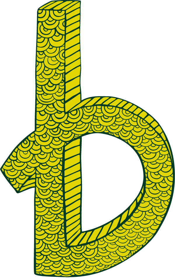
There were many good examples for B, it was hard to choose just one. This one has a nice pattern going on and the 3d is pretty shnazzy. It's a little more like a font than the last one. This was created by Leann Donaldson.

On to the letter C. It seems as if there are less entries for C and the designs are getting more abstract. Surprisingly this crab C isn't the most abstract entry. I like its playfulness and simplicity. It was designed by Jen Montgomery.

So far a number of people have submitted a letter for A, B, and C, hopefully they will keep on going and do all 26.