Tuesday, May 4, 2010

Journal Entry 12: Paul R. Bruski Lecture

Paul R. Bruski gave the final presentation of the Universal Design Symposium. This presentation was titled Info Design in Context. Information design is the branch of graphic design that deals with preparing information so people can use it easily and effectively. The basic premise of this was, instead of complicating a piece of information design, simplify it and allow the information to speak for itself. He presented a three-layer model for design in context.

1) Look (the formal aspects)

2) Context (material)

3) Task structure

He gave a number of examples during his presentation. One of them was Charles Joseph Minard’s 1861 diagram of Napoleon’s March. He did not go in depth about this but I thought it was one of the most interesting. Also it was one of the early examples of info design. Although the details of this diagram are hard to understand, the outcome of the march is very apparent.

Another example he touched on was the information design of Edward Tufte. He showed the classic O-ring failure diagram that stemmed from the Challenger tragedy. This seems to be one of the best examples of how not to display information graphics. Everything is so convoluted and the 20+ pictures of rockets on the diagram are not pertinent to the diagram. These two examples definitely represent his ideas on information design and context, and the three layer the three layer model. Unfortunately in the latter case, the designer (probably an engineer with no design background) did not take these ideas into consideration.

Another thing he talked was the emotional response to design, and how this can help or people them from gathering the information the design is presenting. The example used for this was medical decision aid cards for diabetes. It was amazing how much research they did. The emotional response these cards elicited were also pretty amazing. An object like a medical decision aid does not seem like it would elicit any kind of emotional response. But depending on how the card is designed, people will react differently to it. The most obvious and sensible example of this was the card that was almost entirely text, if I remember right; it was black and white, whereas most of the cards had color. This card was most often labeled as “scary.” I don’t know if scary is the right word, but I can see how something like that could be construed as threatening. Women and men’s reactions were also quite different to each card. That presents a bit of a problem when designing a product that will be used equally by both sexes.

Journal Entry 12: Debra Satterfield Lecture

Debra Satterfield’s presentation was about Design for Behavioral Change and Social Inclusion. First she talked about design as a form of communication. She said that design provides an interface that helps people access information. She said that design lets people interact with information and gives them the opportunity to use it. The next thing she talked about was what design is in the real world. She gave a list that talked about how design is info, experiences, artifacts, communities, structures, and real or virtual spaces that enforce our sense of community. She went on to say that design physically and emotionally supports people, and empowers them to extend their capabilities. Next she gave a definition for Design for Behavioral Change, which is designs that model or direct changes in people’s behavior. One of her other main points was Design for Social Inclusion, these are designs that break down social barriers.

One of her examples was a video game that taught children with autism how to use basic sign language. I thought this was a very good example of her two main points. This product would help direct changes in people’s behavior, not only in the autistic children, but also in children without autism. This product definitely fit the definition of design for social inclusion. Since it could be used by both autistic and non-autistic, it broke down the social barriers.

Another example she gave was a little GPS/phone device for autistic children. The way she presented the device, it definitely fit the definition of design for social inclusion. She showed that since autistic children may not be able to have the same fancy cell phones as their friends, this device would give them a cool device of their own. It also fit the definition of design for behavioral change. It could help change the behavior of the autistic children and their friends. It would give the autistic children new opportunities, and their friends would look at the device and not look down on them because they don’t have a fancy cell phone. I didn’t think this example was the best idea. I do believe that autistic children should be more empowered, but letting them wander around their neighborhoods unattended seems like it could lead so some problems.

The third example she gave was a website that dealt with IBS and other related problems such as Crohns and Colitis. This site also fit the definitions of her two principles. It helps direct or model positive changes in people’s behavior. It gives people with bowel disorders a positive outlook and hope for change, while educating their friends and relatives about what they are going through. It also helps to break down social barriers. This site educates people about these different conditions and helps them find solutions which will eventually break down the social barriers they face.

Journal Entry 11: Robert Hoekman Jr. Lecture

When I first heard that this presentation was going to be about web apps, I must admit I was a little worried. Design involving the web is definitely not my favorite and I thought I might feel the same about the lecture as I do about web design. I was definitely wrong, Robert Hoeckman Jr. actually made web design seem fun, and he had a lot of good ideas about universal design. The main portion of his presentation was about the Essential Elements of Web App Design, which I will list here.

1. Understand users, then ignore them

Listen to what the consumer says with a grain of salt. Figure out what they actually need, not what they say they need.

2. Build only what’s absolutely necessary

Every feature that is added gets in the way of something else.

3. Support the user’s mental model

Putting an item to the trashcan makes sense. Green letters on a black screen don’t.

4. Turn beginners into intermediates immediately

Add features that help advance users of products.

5. Handle errors

People blame themselves for usability problems, usually it’s not their fault.

6. Design for uniformity, consistency and meaning

Make designs uniform, consistent and give them meaning.

7. Reduce and refine

Instead of adding more stuff, make what you have better.

These are the basic principles, which he uses to design web apps, and these principles can be applied to all types of design. The three examples he used were Myspace, Facebook and Amazon. Myspace could learn a thing or two by using the principles from this list. And I guess they will since Mr. Hoekman mentioned he’s working on a project for them. I don’t participate in Myspace or Facebook, but from the lecture and discussion it sounds like Myspace contradicts most of these principles. They need to start ignoring their users, they ask what the users want and give it to them. They start adding all the stuff the customers want, and it’s cluttered. They build way more than what is absolutely necessary. There designs are not uniform and consistent. Since everyone can change his or her own layout, the design is not at all consistent. It sounds like Facebook followed these principles better. Their design is more uniform and consistent, but it also sounded like they may have a few too many features. They should probably start reducing and refining a bit. Amazon.com was another example. According to the lecture, this was a good example of what not to do. I don’t know if I entirely agree with this. I will admit that it is somewhat overloaded with buttons and dropdowns, but for how much information they have to present, I think they are doing it in the best way possible.

Journal Entry 10: Kool Keith album covers

I am not a big fan of rap music, but will occasionally partake of "underground hip hop." One of my favorite artists is a fellow named Kool Keith. He is a crazy guy who has been making records since the 80s. The first group he was involved with were the Ultramagnetic MCs. Since then he has created over 50 different aliases and released a bunch of records. Sometimes his lyrics are a little over the top inappropriate, but he raps about living in space a lot which is pretty cool. I am going to look at three different covers for three of his different aliases. Starting with his first solo release under the Dr. Octagon alias, entitled Dr. Octagonecologyst. Next up is his release under the Black Elvis alias entitled Black Elvis/Lost in Space. And third will be one of his newer albums released under the Dr Dooom (yes, there are three Os), entitled Dr. Dooom 2.

Dr. Octagon is a time traveling alien, who as the name implies is a doctor. He was first introduced in the album Dr. Octagonecologyst which was released in 1996. Kool Keith's albums often feature very simply typography, instead focusing on the art work. This cover only has Dr. Octagon's name, neglecting the album title. The title can be found on the side of the CD. Dr. Octagon is written in a red serif typeface, that for the most part stands out against the background. Since Dr. was placed over his black lab coat, it has the most emphasis. The typeface that was used is somewhat distressed. I don't think this was intentional, but to me it looks like it was printed using old and worn metal type or with too much ink. The red color is important because it ties into the blood stained lab coat.


The next album is a 1999 release called Black Elvis/Lost in Space. This album is unique because part of the album is about traveling through space, and the other part is told from Black Elvis's perspective. The lyrics on this album have futuristic/intergalactic undertones and the cover conveys these ideas well. I like the use of green and white. It is quite surprising that the white outlined letters show up as well as they do, with such thin strokes. Contrasting the large, fancy, futuristic type with the smaller sans serif is nice. If the album title was done in the same style as his name it would be overdone. I can see the little symbols that run vertically down the right side of the composition being used as the basis for a symbol font. They are very simple symbols with a lot of character, and as with the letters, show up very well for having such thin stroke widths.


The final album cover I will look at is the second Dr. Dooom release called Dr. Dooom 2. There was some controversy with an album that was semi-legally released by a company that Keith had a legal falling out with, and this is a response to that. As with Dr. Octagonecologyst, this album features an illustration with simple typography. The illustration has a cool watercolor effect, that is somewhat transparent. This is mostly confined to the green area that creates Dr. Dooom's portrait. There is some "hidden" type contained in this area. The bloody hand lettered type is pretty nice. Dr. Dooom is probably not the first doctor that anyone would like to see, he has a reputation for being a bit of a butcher, and that is why the text is bloody. The skull over Dr. Dooom's name bothers me. I think it would look a lot bette if that whole corner was left as white space, but the skull is tied in with the back cover, which I will also include. It contains some typography in the illustration, in the form of a tombstone with Dr. Octagon's name on it, and a grape juice box. I am disappointed with the layout of the track names and stuff. I think it could have been vastly improved. It is not tied in with the illustration in anyway, and feels like an aforethought.

Monday, May 3, 2010

Journal Entry 9: Beer labels

I have been called a connoisseur of beer on a number of occasions. I don't like to drink a lot, so when I do drink, I drink good beer. I've found labels on some beer (especially microbrews) are really cool and unique. For a while I aspired to be a designer at a brewery, I've given up that dream for something a little broader. Anyway, how does one come up with the concept for a label? It's not like a cd where the music has a certain style, and a certain style of art will fit with that. For example, putting pictures of violins and cellos on a Sublime cover doesn't make sense. In the end, I don't think there is a right answer to this question. I guess you take the brewers brand identity into consideration, the kind of beer (a hoppy beer like an IPA may have hops on the label, while a hefeweizen may have wheat), add that to the name that was chosen for the beer and then mix that all together. I am going to examine three different beer labels, too keep this post more focused I am going to focus on India Pale Ales (IPAs). The first IPA I am going to look at is a new offering from New Belgium Brewing Co. called Ranger, the second will be Stone IPA, and the third is Dogfish Head's 90 Minute IPA.

The first IPA is from the largest of the three breweries, and it is also the newest. New Belgium's Ranger IPA is part of their "Explore Series." I really don't know much about this, and the website does not say much. What I can tell you is that the label design for the Explore Series(and the Lips of Faith series) is vastly different from all of New Belgium's other offerings. Besides the New Belgium logo it is entirely different. Most of their designs feature an ornate picture that looks like an oil painting with the same serif typeface. They are very nice designs and create a unified brand identity, but they have become mundane. To someone who knows and likes the brand they are probably comforting, but they most likely won't catch the eye of someone who is not familiar with the brand. On the other hand, Ranger has a very simple bold design. Two colors (excluding the label) and a strong sans serif typeface really make this stand out. Definitely a good way to mix things up for a 30 year old brand.


The next label I will be looking at, is that of Stone IPA. Stone Brewing Co. also has a very cohesive brand identity. With many of their beers the structure of the label is very similar. The only thing on the label that changes is the colored lines and boxes, and of course the information. This may sound like it would make it hard to tell the difference between their beers, but due to how simple and bold they are it is fairly easy. I personally prefer sans serif fonts for pretty much everything but body copy, but Stones use of a serif font works well and is quite sensible. They have a very strong gargoyle motif which is reminiscent of the medieval ages, when all they had to work with were serif fonts. I especially like the large font they use for the word Stone. I don't remember what the right term for it is, but the way that the letters have a partial fill, and look embossed adds to the gargoyle-ish, medieval motif. The one beef I have with their packaging is with the text on the neck of the bottle. The font falls somewhere between a clean sans serif like Helvetica and a cheesy handwritten font like comic sans. This is the only bottle they do it on, and every time I see it, a little piece of me dies inside.


The final beverage label I will be discussing is Dogfish Head's 90 Minute IPA. You know with a name like Dogfish Head the design is bound to be quirky, and it definitely is. I wanted to find a picture with a layout similar to the others, but due to how small many of the elements on this bottle are, I chose to use this one. Dogfish Head is the smallest of these three breweries, and unfortunately I think it shows in their design. I'm not saying the design is inherently bad, and they definitely have a solid brand identity... But I still feel like something is left to be desired. The font used for their name has a very thin stroke, I believe it is Courier Regular or something. Not the best choice for a headline, when the logo is large it works well, but at smaller sizes it is hard to decipher. Also there isn't enough contrast between the background and the text. The pastel palette is nice, but bumping up the contrast would be a good call. This is especially true for the beginning of the description where it says "What you have here." A pink font on an orange background is tough to read, also they print on something akin to newsprint so the letters aren't as sharp as they could be. Having the description in two sizes, with different leading, and colors is somewhat confusing. I feel like the first part should be a sub head and the other stuff should be body copy. Oh my, I may have gotten carried away on that. I will give Dogfish Head this, what they lack in design, they make up for in good beer. And that is what drinking beer is all about, not overanalyzing labels like I started doing after my first few years of design classes. Also, they do have a pretty decent website.

Journal Entry 8: Sublime album covers

I first heard Sublime's Self Titled album in 1996 soon after it came out and have been hooked ever since. I have all three of their original albums, and the first two of their posthumous albums. In this post I am going to look at three of Sublime's album covers. First I will look at Sublime's first album 40 Oz. to Freedom, next their Self Titled album, and finally their first posthumous album Second-hand Smoke. I mentioned this in my post about Propagandhi's albums, and it also rings true with Sublime, their logo changed constantly with all of their albums and promotional merchandise.

I'll start with Sublime's first studio album 40 Oz. to Freedom. The typographic layout for this album is very clean. The use of only black and white for the text gives it good contrast against the background. Not only does the type contrast with it's background, but it also contrasts with the image. The sun image is very busy and colorful, the simplicity and lack of color of the type contrasts well with this. The use of a script font for the title helps to unify the type and the sun image. Some of the curvy lines of the script font echo the curvilinear lines in the image. Emphasis is given to the band's name by placing it in the black bar. If the designer had not done this, or made the name any smaller it would have been overshadowed by the image.


Next we have Sublimes most popular, "final" studio album, it is a S/T, released shortly after the lead singer Bradley Nowell died of a heroin overdose. I say "final" because there have been a bunch of compilation and live albums released since then. I really like the type treatment on this album. Tattoo styled text on album covers is quite popular, but but not many bands actually use a photo of one of the member's tattoos. The tattoo style is often really busy and crowded, the simplicity of this is a welcome change. If his back were covered in ink, it would have distracted from the name/title and ruined the whole thing. On a non-typographic note, the way the black and white foliage frames the picture is superb. It also helps to camoflauge that pesky parental advisory well.


The final cover I will look at is their first posthumous album entitled Second-hand Smoke. This contradicts everything I said about simplicity, but I believe the busy layout works well on this cover. This is done in a graffiti style which in most cases is very busy. It's interesting that the designer chose to frame a photo with an illustration on this album also. Although the cover is very busy, the band's name stands out very well due to it's large size and bright green color. Another curious fact about this cover is that it does not have the actual title on the front of the cover.

Saturday, May 1, 2010

Journal Entry 7: Typography in Hollywood

In this entry I am going to look at the typography on the covers from three of my favorite movies. Movie covers are very interesting because there are so many interpretations that can be made for one movie. This phenomenon was seen in the recent Take Two movie poster contest. The posters were all different from the originals, and even posters that were created for the same movie were vastly different. Posters and covers are a little different but the premise is basically the same.

The first is for the movie called Trailer Park Boys: The Movie. This movie is based on the Trailer Park Boys show. They took a lot of elements from the show and condensed them down into a shorter motion picture. I think one of the best elements of this movie cover is how they used a dirty old license plate to frame the text. Most of the cars driven by the main characters (especially Ricky's car) are old and kind of trashy, hence the old license plate. They probably could have done a better job at blending the type with the license plate, but this may have become too contrived. They used the same font for all of the elements on the cover, the only differences are the size, and some of it is in italics. It is a very bold font with thick stroke, I believe it is Impact, or something very similar.


The next movie I chose is Donnie Darko. This is the director's cut, I like the cover for the director's cut better than the original because it is less crowded and it generally fits the theme of the movie better. This movie is a science fiction film that is very ethereal and the way the typography for the title was handled, reflects these aspects of the movie. It is hard to tell if the type that is "ghosted" behind the title and words "The Director's Cut" is even the same words. When I look at it, I see what almost looks like an X behind where the D is, but the end of Donnie and Darko look like they have the correct letters. This aspect of the typography is what really gives the ethereal feeling.


The final movie cover I chose is Quentin Tarantino's cult classic Pulp Fiction. It is filmed in Tarantino's signature style with ton's of violence and a nonlinear story line. The slab serif font for the title seems to fit this cover perfectly. I can't think of any other example of lettering that would fit this better. This font is very bold and in your face, just like the movie.

Journal Entry 6: More bicycle logos

Since I was already on the topic of bicycles I thought I would keep going down that trail and examine some logos for specific bikes. I am going to examine three different logos from different bikes from Specialized. If you can't tell, I ride and like Specialized bikes a lot. I am going to include a picture of the bike along with the logo because the design of the logo is integrally linked to the design of the frame.

First off we have the Stumpjumper, this is the bike that started it all. As stated in the previous entry, the Stumpjumper was the first mass production mountain bike to be released, that was in 1981. Almost 30 years later it is still a force to be reckoned with in XC (cross country) racing. Although in that time the logo has undergone many evolutions. Many of Specialized's logos for specific bikes are somewhat similar. They all use unique typefaces, that feel like they belong to a family. This makes sense, and gives the brand as a whole some unity. I especially like the Stumpjumper logo because it really feels like it follows the same lines as the top tube of the bike, and unifies the two. The rounded letters convey a sense of aerodynamics and swiftness.

Stumpjumper

Stumpjumper Expert Carbon

Next is the Demo, this is strictly a downhill bike featuring 7" of suspension travel in the front and 8" in the rear. For comparison, the Stumpjumper has less than 4" of travel, and this bike has only 4-5" less travel than a motocross dirt bike. This bike is meant for extreme riders and extreme terrain. The logo is fitting because it is also extreme. As with the Stumpjumper logo, I think this one follows the top tube quite well. The M follows the line of the top tube just in front of the seatpost. And the way the logo seems to ascend slightly from left to right, also echos the shape of the frame. Also the thickness of the letters have the same feeling of strength and sturdiness of the frame.

DemoDemo  8 II

Finally we have the FSR XC. This logo is interesting because it is composed of acronyms. FSR stands for Future Shock Rear, which is a rear suspension design that specialized patented. And XC stands for cross country. This is basically a cheaper version of a full suspension Stumpjumper. I would have used the Stumpjumper FSR for comparison but the logo is almost identical to the regular Stumpjumper, using the same typeface with thinner strokes. The combination of the solid filled and rounded letters of FSR contrasting with the stroked and hard edged letters in XC is an interesting juxtaposition.

FSRxc
FSRxc Expert


Friday, April 30, 2010

Journal Entry 5: Bike Company Logos

When Im not stuck in class or doing homework (and the weather is nice) I like to spend my time riding my bicycles on mountains. I thought I would take a look at the logos for three quality bicycle manufacturers. Specialized and Kona are large manufacturers that make a wide range of bikes, from mountain to road. Niner Bikes is a more specialized company that focuses strictly on mountain bikes. They are unique because they focus on 29" wheeled bicycles (hence the name Niner), while most mountain bikes feature 26" wheels. Both Kona and Specialized offer 29ers but are not focused on them as Niner is.

At first glance all of the lettering in the logo's looks quite similar. They are all very bold and edgy. Each company wants it's logo to convey the feeling of speed, so they are all italicized as if they were charging down a trail or road. Bicycle companies don't want to be "generic" so they generally don't employ a pre-made font in their logos, instead opting for custom lettered type.

Thus far I have focused more on the wordmark part of the logos, but as you will notice each logo also has a second element. Specialized has a large stylized S as part of it's logo. I found the website for the company that designed the logo (I think just the S and not the wordmark) and it was stated that the logo was designed "specifically for their bike's narrow headtube." Here is a link to that article: http://www.thebrandgarage.com/?page_id=306
Next is Kona, they use a gear shaped element for part of their logo. Since their name is so much shorter it is easier to employ it on different sections of their bicycles (for example the skinny headtube). And finally we get to Niner's logo. Their logo features a large 9. I think out of the three logos I have looked at, it is the most fitting. The big advantage to a 29er is it's larger wheel size, which helps with rolling over obstacles, gives additional speed, and improves traction. The large 9 conveys these ideas well.

Specialized is the oldest company out of these three. They introduced the first mass production mountain bike to the marketplace in 1981. Oddly enough the wordmark part of their logo has changed very little since the early '80s, yet still feels modern.


Kona is the second oldest company out of these three, it was founded in 1988. Although the name comes from Hawaii and many of their bikes have Hawaiian themed names, the company is based out of Ferndale, Washinton and Vancouver, BC. For a company that is only a little over 20 years old their logo has changed quite a few times, I saw about 4 different variations on one page of a google image search.


Niner is the youngest of the three companies, I could not find an exact date, but 29ers started to gain popularity in the early 2000s. Although the trend really took off about 10 years ago, I think Niner is only about five or six years old. They are the smallest of the e three companies, and are more independent, and their logo reflects this. Not that the other two companies are generic or feature generic logos, but they can be distinguished as larger companies.


All of these logos have a wordmark and a separate logo element that can be used on their bikes or for promotional material. Using the other logo element alone is an interesting concept. Usually when you see companies logo, such as Adobe's A logo, it is accompanied by the companies name. Certain brands that have become household names such as Nike will employ their symbol alone, but that is because every one knows them. With a more specialized company such as bike companies, not everyone will recognize the symbol. But the companies will still use the symbol alone on different promotional materials. It's as if recognizing the logo entitles you to membership in an exclusive club.

It would have been neat to look at the logos of specific bikes from these brands but that would have led me far astray and made for a post that was far too long.

Journal Entry 4: Book covers of Neal Stepenson

Since we just finished the book project, I thought I would go ahead and examine the typographic layouts on some book covers by my favorite author, Neal Stephenson. The first book is called Quicksilver and it is from his historic fiction series, The Baroque Cycle. The second book is Cryptonomicon, it is also a historic fiction novel. And the third book is one of his earlier books called Zodiac. Quicksilver was published by William Morrow, Cryptonomicon was published by Perennial, and Zodiac was published by Grove Press.

I picked these book covers for discussion because they are good examples of how typography can help to represent the contents of a book and help sell the book. Of course the old adage "don't judge a book by it's cover" still rings true, but it is good when the inside and the outside of the book are unified. For example, it wouldn't make sense to have a romantic novel with a cover that looks like something from a Rambo movie.

Quicksilver is a historic fiction novel set in the late 1600 and early 1700s. The font chosen for the authors name and title is an old style typeface that is somewhat distressed. I believe that it might be Caslon Antique. This was a good choice for the typeface because of the time that the book was written about. There are parts in the book that are about printing using old style printing techniques and presses. One recurring theme is dissidents printing up libels on hidden press, I imagine the font they would use would look similar to this. Of course it probably wouldn't be printed in silver ink. It looks gold in the photo, but it is silver. Adjusting the color proved tricky due to the glossy paper.


Cryptonomicon is also a historic fiction novel, it deals heavily with cryptography and mathematics. Both the title and the author's name are san serif fonts in all caps. The authors name is in a condensed font that has medium stroke weights and the title of the book is in a font that I wold say is futuristic. It reminds me of something that an engineer or mathematician would use so it fits well with the book. The title font is interesting because of the mix of curvilinear and rectilinear shapes. The letters with round parts (c, r, p, o, etc) are very rounded on the outside but the counter forms of the letters are basically rectangles with 90ยบ angles. Mixing the two makes the letters unique.


As mentioned before, Zodiac is one of Stephenson's earlier novels. This novel is an ecological thriller about a grassroots environmentalist, who is involved in a semi-legal campaign to save Boston Harbor from large chemical companies. As a side note, the main character is not concerned only with Boston Harbor, that just happens to be his main focus in this story. The handwritten text fits very well with the grassroots theme that runs throughout the book. The main character rides around on a zodiac taking water samples and also uses it on other "missions," it talks about how the name of his environmental group, GEE International, is spray painted on the side of his zodiac. This ties in with the handwritten font on the cover. This is a newer addition of the book, I won't even mention the first edition, it was horrible and kind of scary.


I started reading Stephenson's books when I was in middle school and have since acquired all but one. I picked them for discussion since we just finished the book project and because all the covers represent the books well. It is hard to say what my initial reaction to these was because I've owned them for between two and seven years. These books are definitely a case where I would not make a buying decision based on the cover. I can confirm that is true because one of his books has a terrible cover but I bought it any way. If his books have bad covers, I will probably look at them and judge the cover, but not the contents.

Saturday, April 17, 2010

Journal Entry 3: Propagandhi's typographic treatment

Propagandhi is a band that makes self-styled "progressive thrash" music. They've been rocking since about '86. Throughout their 20+ years of existence, their sound and album cover quality have developed and matured quite a bit. In this post I will be examining there three most recent album treatments.

The first is their 2001 release Today's Empires, Tomorrow's Ashes.


As you can see this title uses a bold slab serif font, that has been distressed. The same font is used both for the band and album name.

Next up is their 2005 release Potemkin City Limits.


For this album they went to a stencil and san serif combo. It's a little bit less distressed for the most part. And there is more stroke contrast between the band name and album title.

The third example is their 2009 offering Supporting Caste.


This was quite a change. Much cleaner. An elegant serif typeface, mixed with a fancy italic (almost script) font.

Looking at all of their album title's and merchandise, they must have at least 10 variations. This seems to go against all of the principles of branding. Some bands will always have the same word mark (some use letter marks, and symbol marks, but I will disregard those for now) for all of their albums and merchandise. I think it may be a genre thing, metal bands and 70s/80s bands like Boston and Chicago seem to stick with the same word mark for all of their albums and collateral. In any case it doesn't seem to be hurting them.

We talked about hierarchy for the book project in regards to the title, and author's name. Usually the book title has more emphasis, except in certain cases where they are trying to sell a book by a popular author. On every album I have looked at, the band name has emphasis. Ultimately this makes sense, it was just another interesting dissimilarity I noticed.

The typefaces that were chosen fit well with the music, if that makes sense. Today's Empires and Potemkin City Limits are both rougher. I don't mean rougher in recording quality, they are all recorded well, but more furious and more in your face. While Supporting Caste is more refined. It rocks just as hard (if not more so), is just as loud and is just as impassioned, but the music and lyrics are over all classier, along with the type treatment.

Tuesday, April 13, 2010

Journal Entry 2: Alphabattle!

LetterCult.com is a site I visit quite frequently, it's dedicated to custom letters and the people who design them. This year they are doing what's called Alphabattle. The name is somewhat misleading, as stated on the site, it's not a battle or even a contest. It was started last year as a Flickr group, and LetterCult decided to carry on the torch.

It's basically a forum (not in the literal since) where people can post custom letters they design. It started in March and every two weeks they will post up the new letter, going in order from A to Z. There are a few basic rules, the main one being that the letters must be made from scratch, not from a font.

Right now only A, B, and C are up but there are already some very interesting, and extremely unique custom letters. Here are a few examples.

Pancacke A... Yummy.
Maybe not the best example in terms of traditional font design, but certainly the most delicious. This was designed by Joshua Harless.

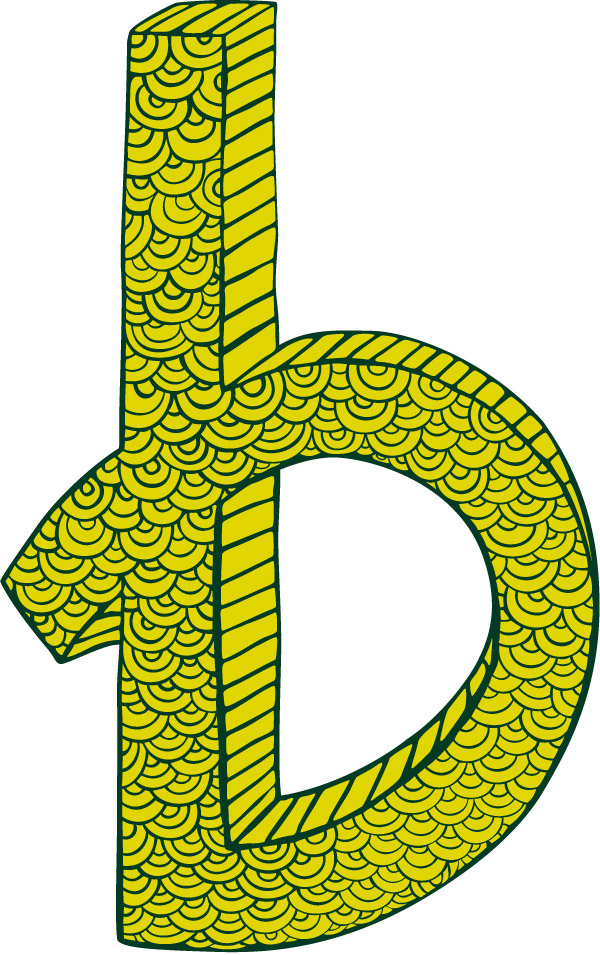
There were many good examples for B, it was hard to choose just one. This one has a nice pattern going on and the 3d is pretty shnazzy. It's a little more like a font than the last one. This was created by Leann Donaldson.

On to the letter C. It seems as if there are less entries for C and the designs are getting more abstract. Surprisingly this crab C isn't the most abstract entry. I like its playfulness and simplicity. It was designed by Jen Montgomery.

So far a number of people have submitted a letter for A, B, and C, hopefully they will keep on going and do all 26.


Monday, March 29, 2010

Journal Entry 1: Type and The Mountain Goats


This is a music video for the song "Sax Rohmer #1" by one of my favorite bands, The Mountain Goats. The song is from their 2008 release entitled Heretic Pride. Just for reference it is their 16th studio album, not including EPs and compilations. I first saw the video when it came out about 2 years ago, and stumbled across it recently while on their website.

I picked this video for my type journal because of how well the typography fits with the lyrics. It is one of the best examples of integrating type and lyrics together. Instead of just placing the words onto the various surfaces, thought was actually given to the word's meaning. Here are some of my favorite examples – the word harbour has nautical symbols for the letters, the words broken bricks are spelled out on a pile of broken bricks, aftermath is a jumbled mess almost like a broken mirror signifying the aftermath of a decision, heads are used for the a and d in the word heads, and the words both sides are painted on both sides of a door. Those are just a few examples, but each word was placed thoughtfully to give a particular feeling or meaning. I especially like how the verse that starts at about 1:56, that talks about chalk marks, were made using chalk. At this point they start having some sectionsof lyrics in all caps, and then the same lyrics in lower case, below or next to the all caps. At about 2:05 the word descend is spelled out backwards and descending towards the next word, and at 2:30 they have lyrics written in the palms of their hands, that are written left to right, but read right to left. I like how they did not stick with the normal direction for reading. This could lead to confusion, but in this case it fits with the flow of the music video. I could go on in this vane and talk about almost every word in the song, but I will hold off.

My initial reaction to this was a large grin. It incorporates a few of my favorite things, The Mountain Goats, and playful hand lettered type. I generally expect TMG to have good music videos, and this definitely did not disappoint. This example produced a feeling of completeness. The way that everything fit together was amazing, and I can't imagine adding or removing anything.